
Trevo. Revitalising hotel mobile check-ins.
Project Background
Trevo is a Singapore based white-label solution for the hospitality industry, allowing guests to check-in digitally through different mediums. This includes mobile web-apps, kiosks and keycard dispensers for an end-to-end experience.
Our team was tasked to improve the UX and redesign the UI of the current web-app for our pro-bono client project in General Assembly. Having only 2.5 weeks catered for this final project, we focused purely on the mobile check-in process up till the submission of the request. We were also challenged to include upselling options.
ROLE
TEAM
4 Members
TIMELINE
2.5 Weeks
Research


What causes self-service to feel slow is not the number of steps, but rather losing track of where you are.
Guests grow impatient when they cannot tell which step they are on, whether their details have been registered, or how much of the process is left. The cognitive load that wears travellers down is more about uncertainty throughout the process, not so much the work itself.
What makes critical tasks unsettling is not their difficulty, but the absence of confirmation once completed.
Critical tasks can feel unforgiving to guests. Guests grow anxious when they cannot tell if a passport scan was accepted, a booking was verified, or payment details were captured. The unease comes more from the lack of feedback that follows an action, than from the difficulty of the action itself.
What guests want from check-in is not merely to complete a booking, but rather the chance to tailor the stay around their own needs.
Travellers arrive with personal hospitality needs that would ordinarily depend on staff to handle, such as extra pillows or a quiet room. This appetite leans more toward service and customisation than toward upgrades, which guests tend to resist when these are pushed on them.
Taken together, these insights point to one underlying idea. Guests judge a self-service system not so much by how long it actually takes, but by how it feels as they move through it. This sense of perceived time is what we set out to shape. To keep these findings grounded in real behaviour, we framed them around two travellers.
Personas

Benjamin will be traveling to Singapore for one of the biggest tech conference in the region. He likes to ensure that he plans everything ahead of time so that he does not have to worry during his trips. He often considers upgrade and add-ons to elevate his work trips.
However, Benjamin feels uncertain when using self-service processes, especially when it comes to confirming that his details and requests for upgrades and add-ons have been accurately captured.
Problem Statement:
Benjamin needs a clear and efficient check-in process where he can feel assured and confident that all his arrangements are confirmed so that he can focus on his work.

Natasha and her friend, Imran, are going on a spontaneous backpacking trip in Vietnam. They are not particularly concerned with strict planning or organisation, and in fact struggle with administrative tasks.
She experiences frustration when encountering unforeseen time-wasters during their leisurely trip (e.g.: queuing up at the hotel). They just want to get over the boring parts so that they can maximise their trip.
Problem Statement:
Natasha needs a hassle-free and streamlined online check-in process where she can get through the dull so she can start vacationing.
design directions
We translated our insights and constraints into the principles that guided the redesign. Reducing cognitive load, assuring guests at the critical moments, and giving them more room to personalise their stay all work toward the same end, making the process feel shorter, lighter, and more hosted than the clock alone would suggest. From the structure of the flow to the clear and immediate feedback at the tasks that matter most, every decision that followed was measured against these three intentions.
— Maxim, CEO, Trevo.ai
solutions
Reducing cognitive load
The first feature we proposed is a progress bar with 4 distinct stages: Guest Information / Room Configuration / Payment Information / Confirmation. Guests will not only be able to clearly see which part of pre check-in process they are in but also know what is coming next through the icon imagery. They will also be able to move back a stage to change any input, or exit the task entirely.
Trevo's original design had the email address input placed in the middle of the user flow so the confirmation email could be sent to guests. When we raised concerns about this being an extra step for guests when they would have already been provided a reservation number, Trevo informed us that this is a necessary step as the hotels would not be able to share the guests' email address. What we proposed was to bring forward this step right at the beginning and mask it as part of the reservation look-up process to streamline it.


A major design decision was to introduce components such as cards with clear system signals and visual cues. This way guests would be able to know their current completion status with a single glance.
Assuring guests at critical moments
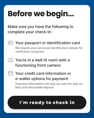
The first critical task guests encounter is the capturing of their identification. A preparation page was placed after the reservation lookup step to set expectations and reduce surprise when this task arrives. During the identification step itself, clear graphics and animation guide guests through the capturing and auto-fill process while also occupying the wait as the system works. The facial capture was then placed together with the identity capture, so the two related steps are completed in one place.
The pre-payment redesign was simple; I utilised known payment UI formats so guests need not familiarise themselves with a foreign layout.
At the end of the pre-check in process, a clear, thorough summary is presented to guests so they can check their information and requests before submission. This allows for some margin of error in the entire process so guests can rectify should they need to. The final confirmation page closes the loop after the irreversible submission.
Service Requests and Upgrades
Here we answer the client's challenge to include upselling as part of our redesign. The original Trevo service requests and upgrades sections were both designed in a form layout, which contributed to their lack of organisation and appeal. I redesigned the two sections separately. The form layout was kept strictly for service requests, presenting the more common requests as suggestions with quantity inputs, alongside a manual text field for any additional details.
For the upgrades section, I moved to a card layout with overlays to increase appeal and ease of use. This makes room for product images that sell an experience rather than list it, supporting stronger upselling rates. To give guests with no need for upgrades a sense of agency, a "Skip this step" button allows them to pass over the section entirely.
Design system

I took the liberty to create a design system documentation of the new proposed design. Since this is a white-label, the specific colours and fonts used were not too important as they can be switched to the specific hotels' branding. The most important sections of the documentation would be the spacing scale and the component previews. Spacing helps to set the grid system and lock the UI in place, while the components help future clients of Trevo know the different "molecules" and "organisms" that exist in this product.
Iterations
A few test users did not realise that they needed to take a selfie for face verification and were surprised by this critical step even though a Preparation Page was implemented at the beginning. This told us that guests were inclined to finish the process as fast as possible and hence skip over important information critical to finishing the same process. What we did was separate 3 points into 3 separate screens, prompting guests to pause at each one.
Some test users were not sure which rooms were allocated to whom, especially when they wanted to make guest-specific upgrades and requests. They realised the assigned rooms only at the summary page at the end. To fix this, we implemented a name tag component on the guest cards with a down chevron button, to indicate that guests are able to swap the allocation on their own.
Finally, the user flow we designed required all guest information to be provided in one sitting, meaning all guests needed to be present at the same time while going through the pre check-in process. Test users pointed out that this was not efficient as there tends to be a primary guest handling the administrative side of this process.
We adjusted the user flow to allow multiple guests to use the same booking ID to check-in themselves and adjust room preferences, resulting in a Guest-Room toggle. The primary guest will still have to submit payment details to confirm the request.
reflection
Being the only member with a visual design background, I was more than happy to take the lead on the user interface front. It was however not without its challenges especially coming from the perspective of the advertising industry. I learned to shift my thinking from a macro, conceptual space to a micro, evidence-based spot by being actively involved in the research process, and delving deep into the user insights and making sure that feeds the design thinking that arose. The clear insights-to-solutions connection was very rewarding.
Interacting with the stakeholders (the Trevo client team) directly to retrieve and clarify pain points was also a great experience. It allowed us to learn of certain limitations we had to work with, such as the email address input situation.
© Fabian Ong 2026 All Rights Reserved